Work
About
Contact
Newsletter
Card Shop
Instagram

Katú Premium
Yerba Mate

Brand development, visual identity design, and packaging design for Katú Premium Yerba Mate.

Katú is a beverage startup that creates innovative energy products from 100% USDA Organic Paraguayan yerba mate.

They have a deep commitment to their growing region in the Atlantic Rainforest and the family farms that cultivate their yerba mate through traditional, sustainable methods.  

Art direction and video by Jake Viramontez

Product photography by Aubrey Lorraine and Dawn Heumann

A toucan logo next to the words Katú Premium Yerba MateA quote that reads: Although is has taken more than a decade to return my land to the traditional cultivation of organic yerba mate, I knew I was on the right track when the toucans returned.A farmer harvests yerba mate by hand under the lush canopy of the Atlantic Rainforest.

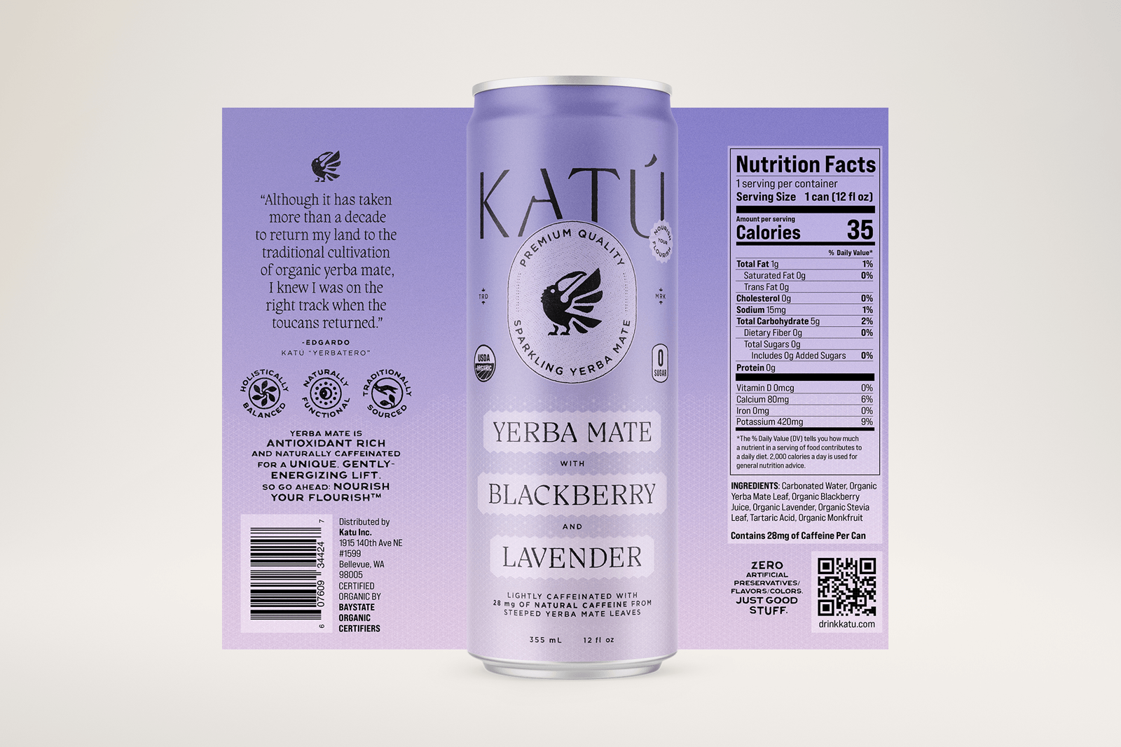
The aesthetic of the loose-leaf lineup celebrates the traditional rituals of preparing and sharing yerba mate, with tactile paper bags speckled with custom badges, illustrations, and typography.

A top-down view of a green yerba mate bag next to a bowl of yerba mate and a glass with two ice cubes on a concrete surface.Product packaging for three different types of yerba mate: Slow roasted, raw traditional, and a hibiscus infusion.An ancient, crumbling archway with a yerba mate tree growing at the center and the full moon shining in the background in a simplistic, line drawn style.An ancient, crumbling archway with a yerba mate tree growing at the center and hibiscus flowers winding their way around the arch and the full moon shining in the background in a simplistic, line drawn style.All four sides of a purple bag of yerba mate showcasing the packaging design.

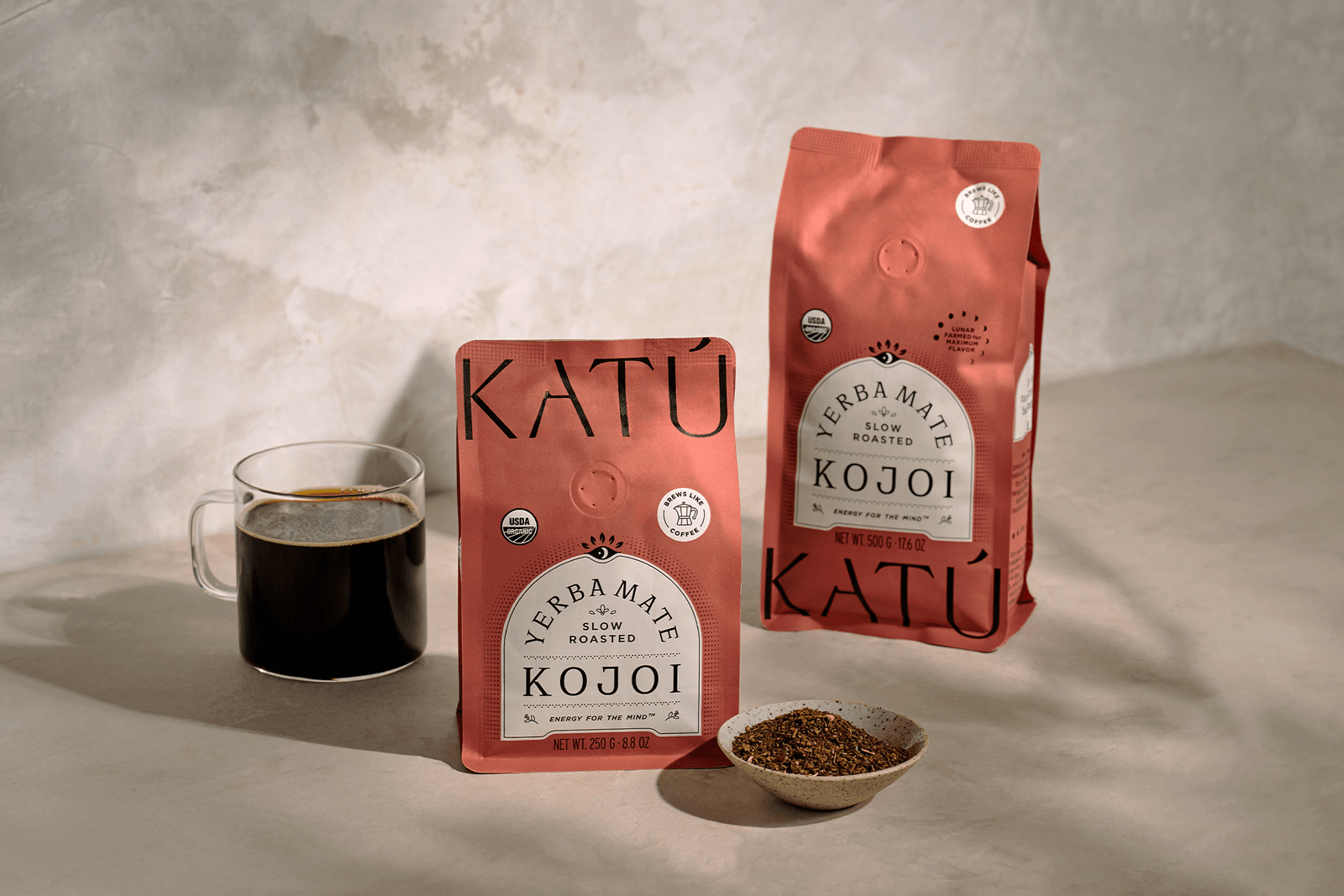
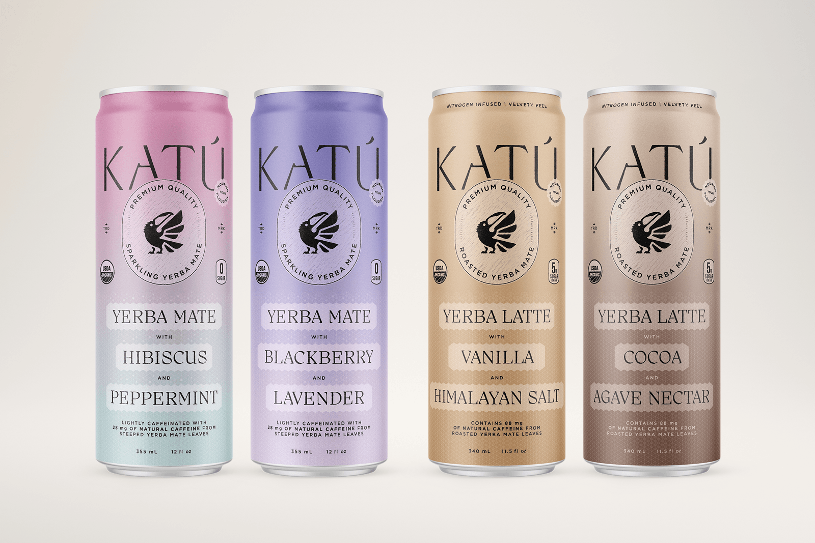
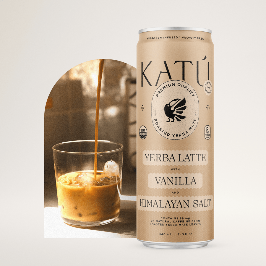
Roasted yerba mate is a Paraguayan specialty, and has a deeper, more complex flavor profile than what most consumers are familiar with: products made from yerba mate that is brewed raw.

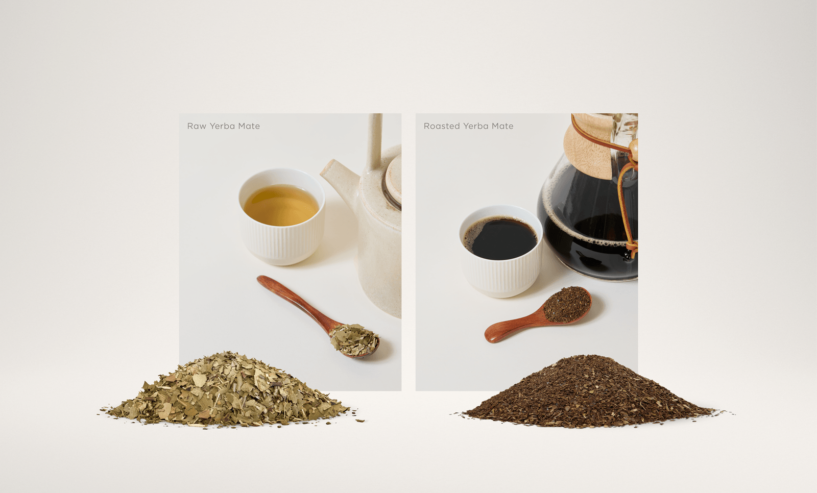
Communicating the difference between these flavor profiles was a central design task. It was especially relevant in the canned lineup, where the roasted flavor varieties competed with coffee, while the raw varieties competed with seltzers, kombucha, and fruity energy drinks.

A card that reads "life is too short for bad energy" followed by the Katú wordmark.
* * * * *

“Having partnered with a world-class designer for seventeen years, I recognize great design and design ideas, and I think what you’ve accomplished is extraordinary."

Rick Braithwaite
Katú Investor
An arrow icon pointing up and to the right.
Let's collaborate

Ready to start a packaging project
of your own? I’m here to help.