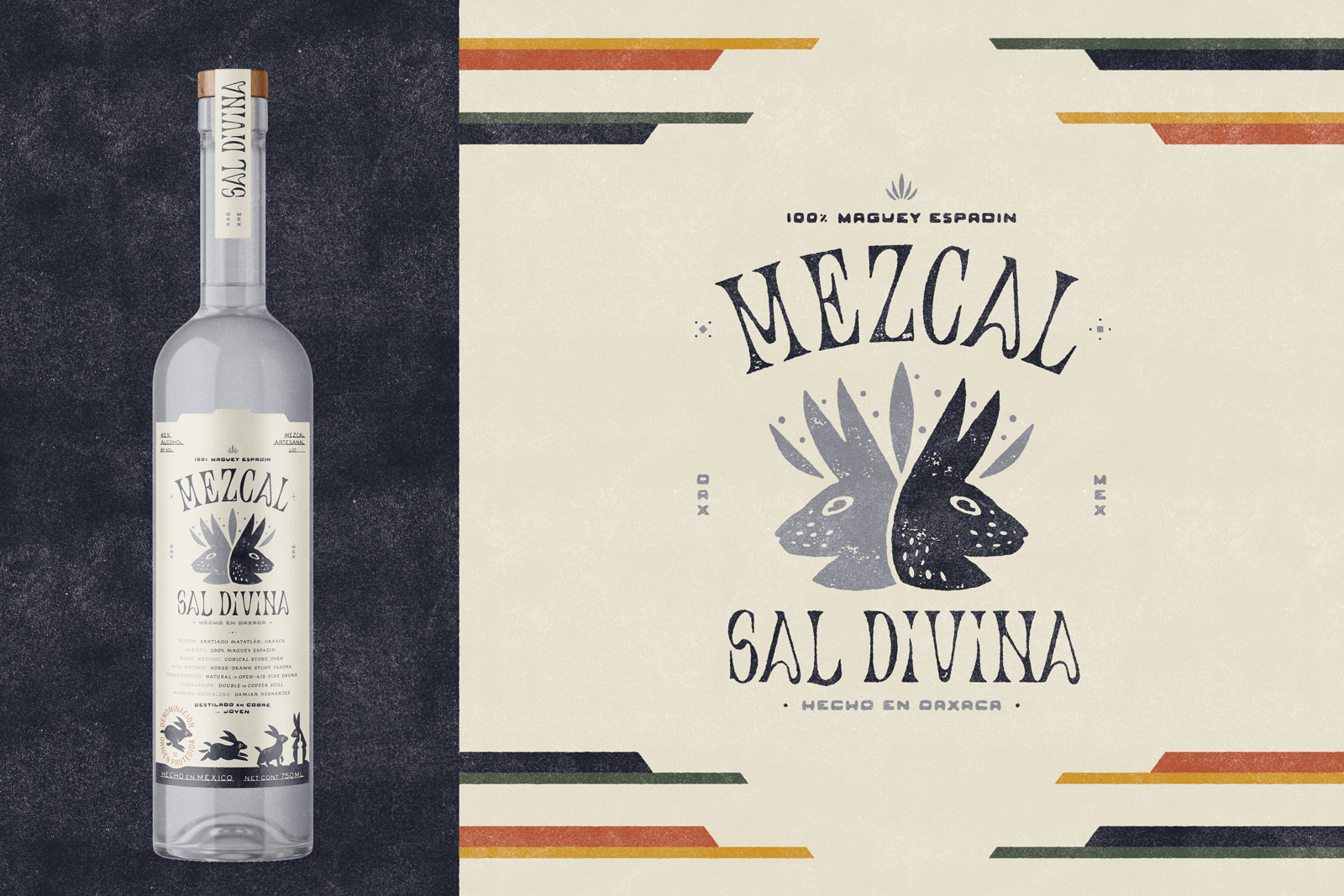
Brand development, visual identity design, and packaging design for Sal Divina Mezcal.
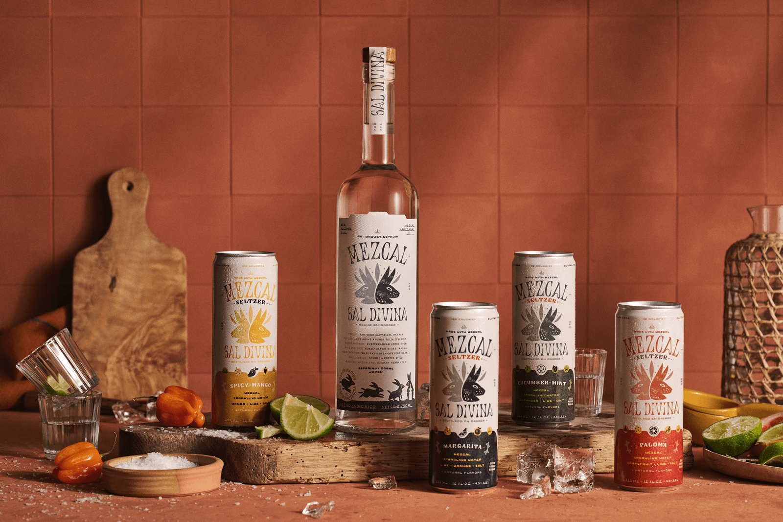
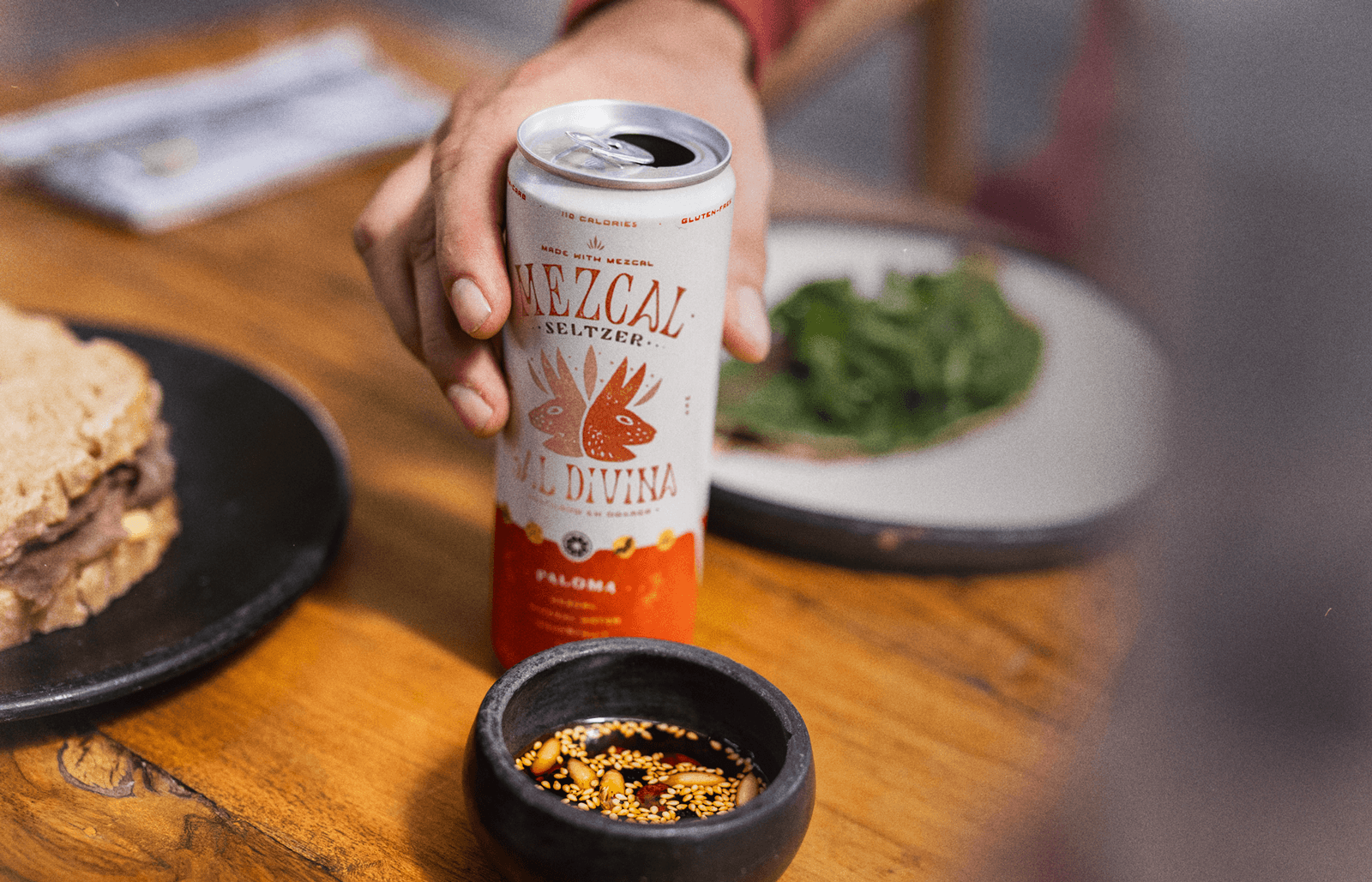
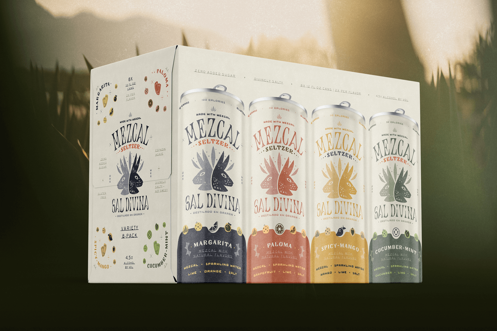
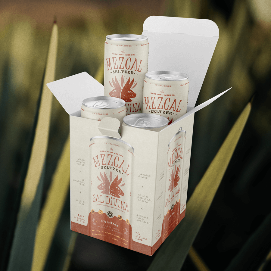
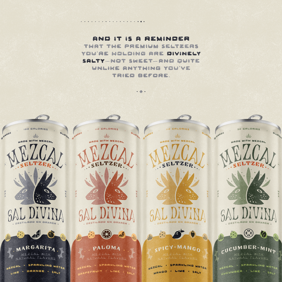
I was approached by Sal Divina to help craft an identity for their vision: to bring artisanal caliber mezcal to the canned cocktail aisle with a lineup of premium mezcal seltzers in four salty, savory flavors.
This identity had to work in tandem with a line of bottled mezcal, beginning with a signature 750 ml Espadín by fourth-generation mezcalero Damián Hernandez.
What started as a brand identity engagement became a founding role — I joined Sal Divina as co-founder and Creative Director, and have been building the brand from the inside ever since.
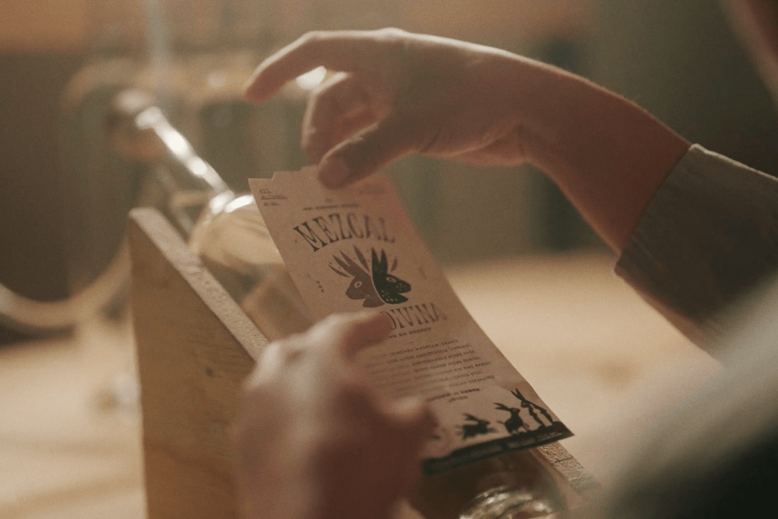
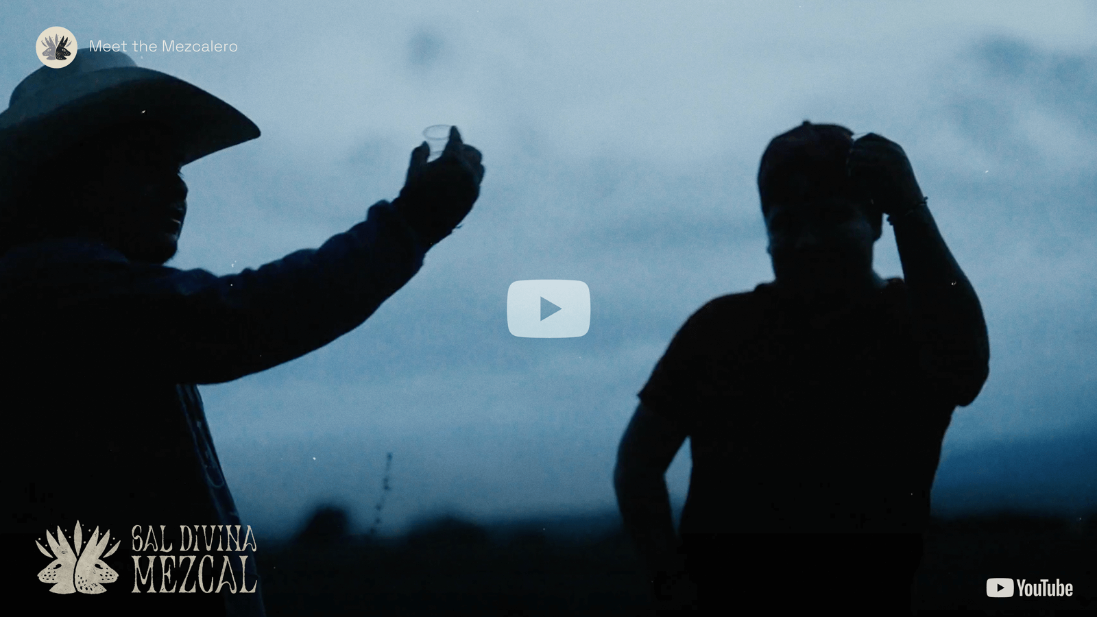
Video and environmental photography by Jake Viramontez
Product photography by Dawn Heumann
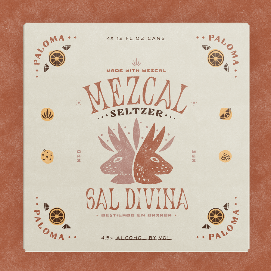
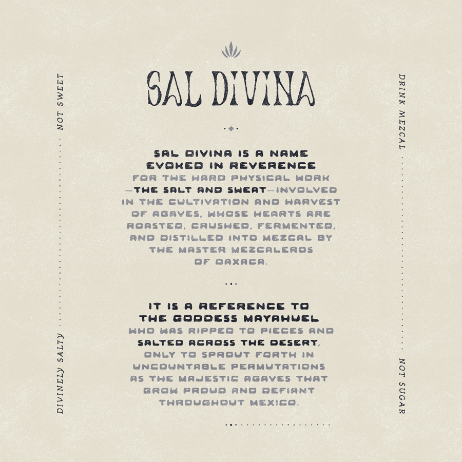
The rabbit head logo portrays Two-Rabbit, child of the goddess Mayahuel and ancient allegory for the double-vision effect of drunkenness. The ears form the spines of the agave plant from which mezcal is made.
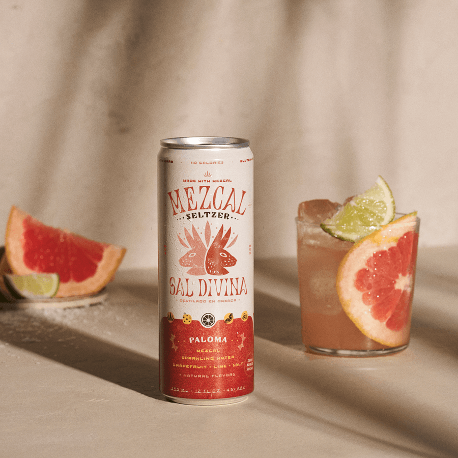
The salty, savory flavor profile of the zero-sugar-added seltzers positions them at the leading edge of the next generation of ready-to-drink alcohol, targeted to the evolving habits of discerning, health-conscious drinkers seeking complex flavors over sugar highs.

This ambitious positioning required a bold aesthetic — flexible enough to celebrate the traditions, artistry, and immense flavorful depth of mezcal while simultaneously breaking the spirit free of the dimly lit bar shelf and into its new context as a sharable, crushable on-the-go option.
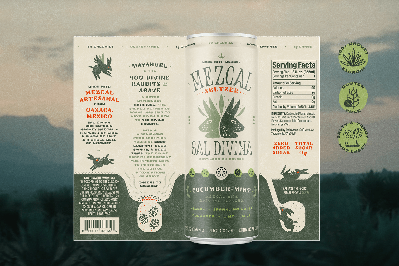
The can is designed as a full 360º story, achieving meaningful brand immersion while simultaneously reserving space for what so many alcohol cans omit: transparent nutrition and ingredient info.
“Qué chingón"